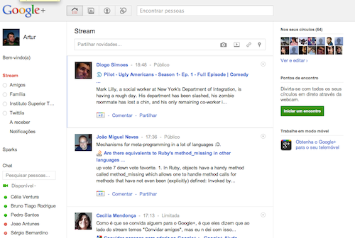
I’m loving Google+, but they seriously need to use different font sizes. With only one font size in the Stream everything seems cranked up to 11, making it hard to read:

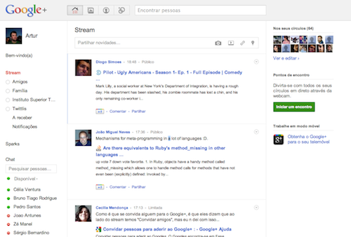
After tweeking the CSS in Chrome I’ve decreased the font size of the messages, with different sizes for the user comment and page message. I think it looks better.

Comments
6 responses to “Google + needs different font sizes:”
I prefer the Google+ one :/
I like the first one.
+1 for Goole+’s fonts.
I agree with the OP. Make everything look flat…
Sorry, first one is better.
use a decent screen resolution. anything less than 1680×1050 (a decent 15 inches laptop, rare these days) is not even worth it.