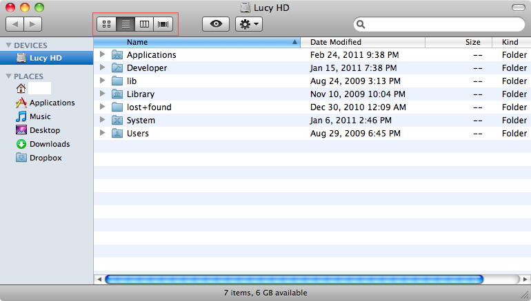
How do I know this? Well I don’t but I’ve found something particularly weird on the recent build of Lion. The video that once was in this page you could see some of 10.7 new features. Particularly what caught my eye was the “view as…” buttons. Check this image from my Snow Leopard Finder:

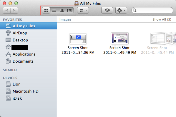
See the highlighted buttons? Now check the finder on Lion:

That wasn’t a simple cosmetic change. You can drag the nob instead of simply clicking a button. Also this kind of control is present on iCal, and probably other applications.
This kind of control doesn’t improve the usability of finder, actually is harder to drag the nob using a mouse. Why did Apple make such a change?
The multi touch conundrum
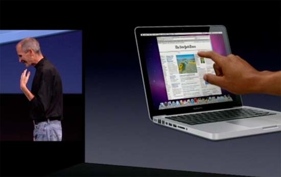
In one of the keynotes Steve said touching the screen doesn’t make much sense:

Although there must be occasions where touching the screen and still maintaining a physical keyboard might be helpful, for the most part I agree with him. Using multitouch this way should induce arm fatigue and pain. But the multi touch that Steve presented, by using the touchpad, doesn’t make sense either. Moving the mouse to use that kind of controls is quite gimmicky and I doubt apple would make such a thing. That Apple has a iPad-like Mac for test purposes I think is a given. Maybe hidden from view inside a disclosed location in Infinite Loop, but I would be amazed if they didn’t researched such a possibility. But inserting such controls in Lion is a preemptive move, in preparation for some kind of future hardware where you interact with OSX applications using touch.