My current job is at Project Fenix, the academic administration tool for managing Instituto Superior Técnico – from student grades, occupation requests up to parking access. Fenix is a very large application with almost 1300 entities on a rich domain. I started working on this project when I was in college, and back then I had problems reading the 20000 line file describing the domain. In order to inspect the structural representation of the domain, I’ve built a simple tool that displays UML diagrams of the domain entities and their relations called Fenix Domain Browser. The UML diagrams are generated by Graphviz’s dot, and I have built a custom parser for our domain modeling language. This is an interactive system in which you explore by clicking each entity. An example follows:
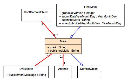
For a long time I had the idea to make a poster with all the entities and their relations. However Graphviz’s dot can’t handle graphs this big. It blows up with a SegFault. After searching for a while I’ve found gephi, a tool design to data mine gigantic graphs.
Using tesseract I’ve build a few scripts to output the relational structure of the domain, outputting the data in a format called GDF. After that is just loading it up into gephi and spread the graph, and paint the nodes.
This is the result:
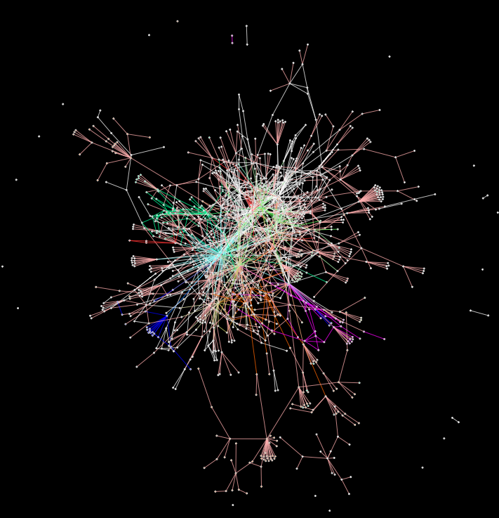
The cool part about this graph is that you can actually see how the college works. The colors are separation of important parts of the system:
- cyan: Person
- red: Teacher
- ligher green: Student
- orange: Accounting
- blue: Personnel Section
- purple: Assiduousness
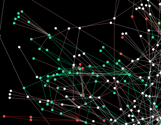
- darker green: PhD
Each line represents a relation. Pink lines represent inheritance in which a entity is the the specialization of another, while the rest represent a relation between two entities (e.g. Person has a Card, Student has a grade).
The most important entity is Person. This entity represents the concept of a person with which the college has a relation with, either being student, teacher or employee. This is at the heart of the graph because is the most connected entity.
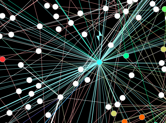
In this highly connected area we can see three important entities, Teacher (in red), student Registration (right next to Teacher in green) and Student (farther away, in green).
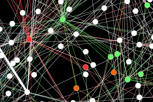
The centre and the top right areas have the most chaotic relations. This is because this is the oldest code and the system core functionality. Also the center of the graph has the most abstract entities while the fringe ones are more specialized. Other interesting discovery the fact that account is spread through the system.
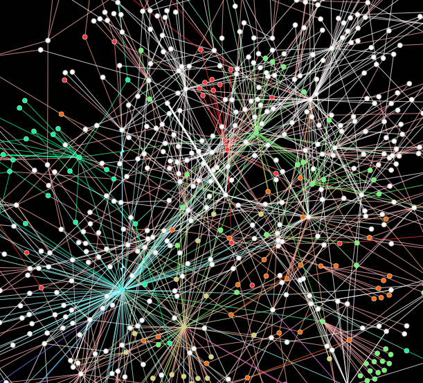
In almost every part of the graph there is an isolated accounting entity. However the accounting platform main section is located in the lower edges. The assiduousness code also shares features with accounting (has to do with employee daily checkins).
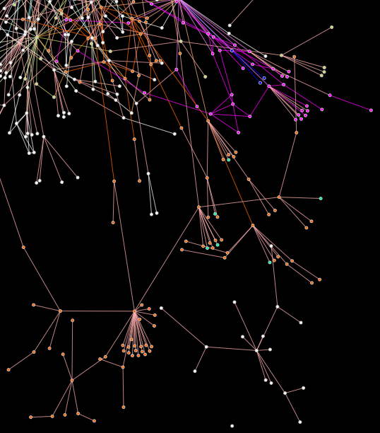
Also interesting, the phd section is away from the center. This is due being really recent (1-2 years old) and still being developed.
The tree shapes you can find on the graph are the result of a entity being inherited several times.
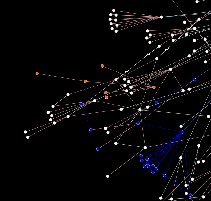
The dots unconnected to the main graph are entities that have no relation with the information on the system. They are normally things like system information (logs, cron jobs, etc.) or super abstract stuff that has no relation with the rest of the information (time tables, calendars, etc.).
After generating this, I did some labeling, printed it into a poster and placed it into the lobby of our office. Makes an awesome motivational poster!
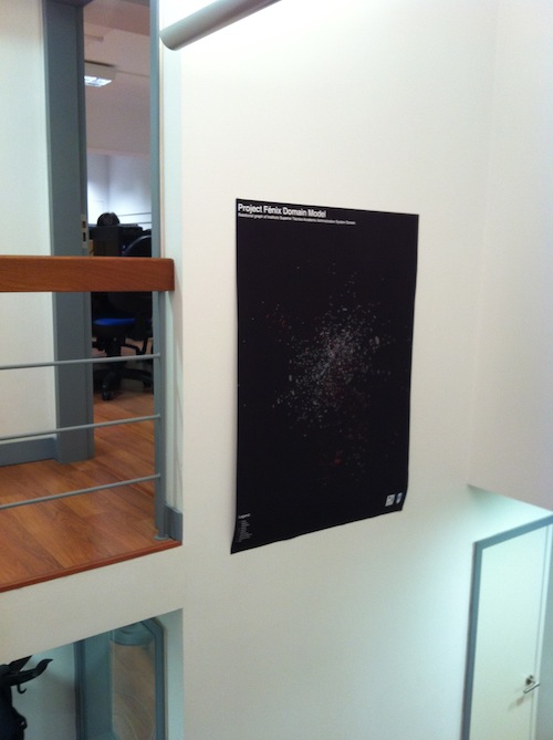
This was a cool side project that yield a fun poster. However we can use this information to segment the domain file into smaller files, by separating the color clusters of the image.
You can download the images here:
The next step
This poster has about 1300 entities and 1500 relations. What I want to do next is the instance graph.
Fenix currently holds 40 million instances from all the entities. Generating such a graph creates both design and engineering problems. The first is that generating such graph is a tour de force . There are memory and computational problems. I don’t know if gephi can handle this many instances in a single graph. Most likely this must be done using distributed computing. Second is how to display over 40 million instances and actually see something. besides a gigantic blob.
Comments
2 responses to “Visualizing a college organizational domain graph”
[…] This post was mentioned on Twitter by B.Blacha and HN Firehose. HN Firehose said: Visualizing a college organizational domain graph: http://bit.ly/fX8oTF […]
[…] you ever read yours truly, probably you’ve know that some time back I’ve generated a big poster with the entire domain of Project […]